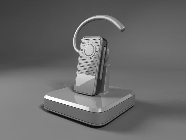
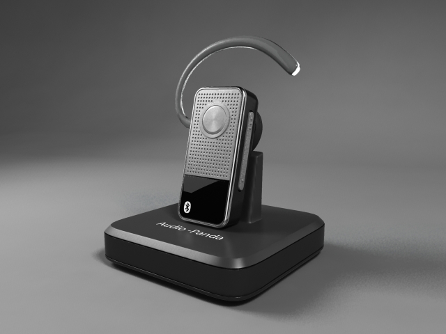
First we built a simple backdrop using the CV curve and a loft.
The next lesson went over working with lighting in our scene. I never thought on how important lighting was in a scene until now. It can make things look incredibly better. (Two Lights).
In addition to this, here is also what it looks like with final gather and turning the lighting intensity levels a bit lower.
In the next lesson we started creating a plastic material for the casing. The material that we are using in in the mental ray section of the hypershade and is called mia_material_x.
In the following tutorial we went over a little bit about created a brushed metal texture and what some of the tools/options for the materials did.
After that we went through creating 3 more materials for sections of our headset. First we made a new mia_material_x for our earbud piece. We changed it to a rubber preset which was already made. Maya's mia_material_x for 2013 has a lot of useful presets.
Continuing we assigned another mmx (mia_material_x) to the headset's rim. We used the chrome preset and just left it at its default settings.
Finally we used another mmx material on the lower square geometry. We left it at its default besides changing its color to black (giving it the appearance of shiny plastic).
In the next lesson we went over creating a blurry plastic material for the headset's charging base. We also put a frosted glass texture on the ear hook. It is amazing how much the frosted glass preset on the mmx actually looks like real glass!
Here is the same texture just different angle. The color of the transparency is dependent upon the angle of the render and what it's background is.
In the next lesson we added some logos to our mental ray materials using a uv_snapshot and photoshop.
We moved on to the microphone speaker next. We used a cloth texture on a circular plane combined with a plain lambert.
In the same lesson we took a black plane and placed it underneath the metal grating. It is a very subtle difference in shadowing in the holes.
In the following tutorial we started working on the LED light. This is really cool too! We messed around with connecting a blin material and a bulge material and connected it in various ways using the hypershade. Here are a few renders showing some of changes.
Finally we messed around with the render settings and put the settings at the highest quality. Here are the some of the final renders.
These rendering tutorials were really cool, I hope to use what I learned in future personal projects. Follow along soon too see the next set of tutorials I go over.


intensity_lower.jpg)


Fantastic insights! A strong 2D animation agency can turn ideas into engaging visual stories. At TVS Cube, we specialize in delivering creative 2D animations that captivate audiences and enhance brand storytelling
ReplyDelete